Supported devices, browsers and screen resolutions
The platform can operate as a browser application on the following devices: PC, tablet, or mobile phone.
During initialization or screen resolution change the system verifies whether the user’s current screen resolution is suitable for continued seamless operation. It also checks the OS and browser versions. We recommend having one of the following screen resolutions and one of the following versions of OS and browser for the proper functioning of the platform.
Supported screens resolution
Desktop - minWidth = 1440
Tablet - minWidth = 756, maxWidth = 1439
Mobile - minWidth = 320, maxWidth = 755
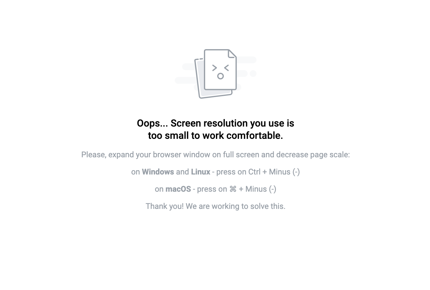
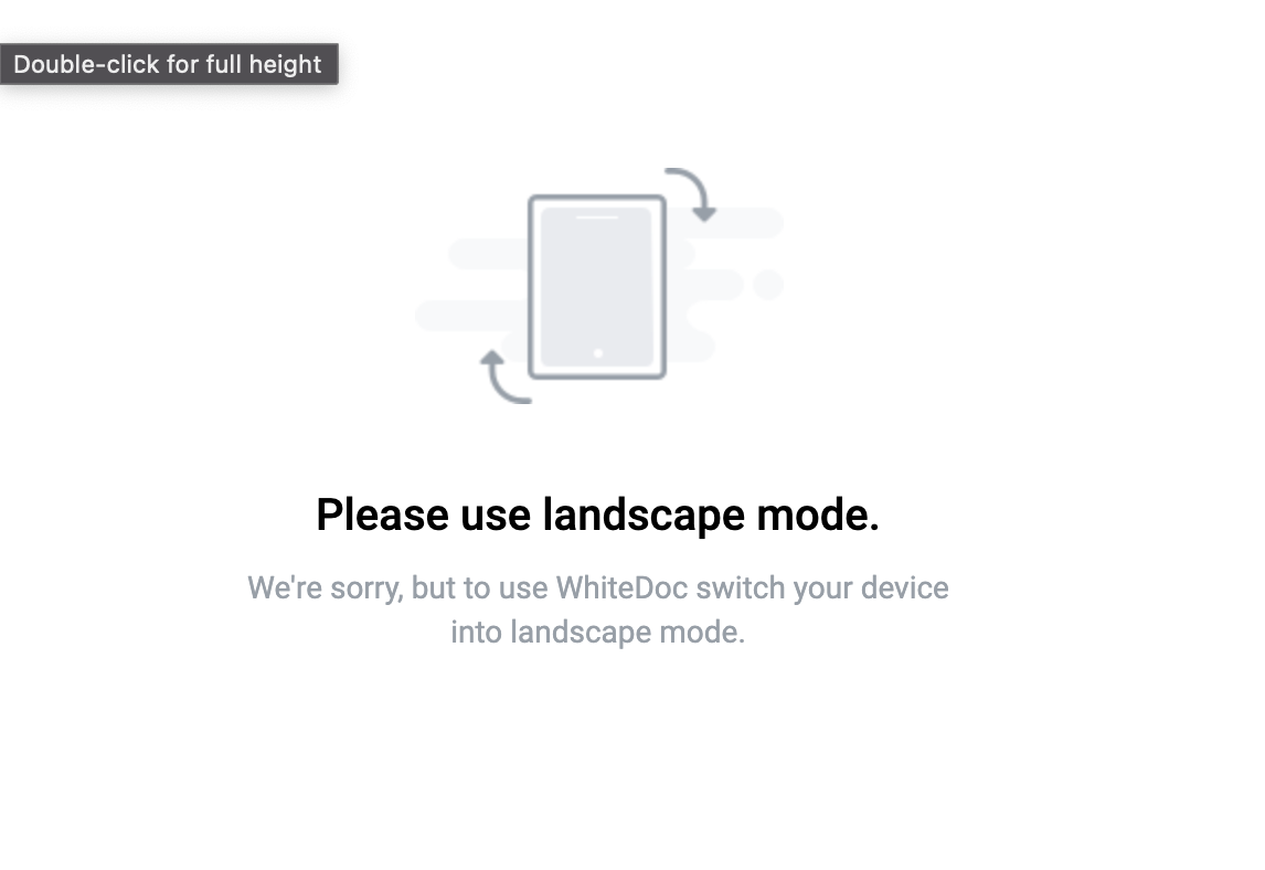
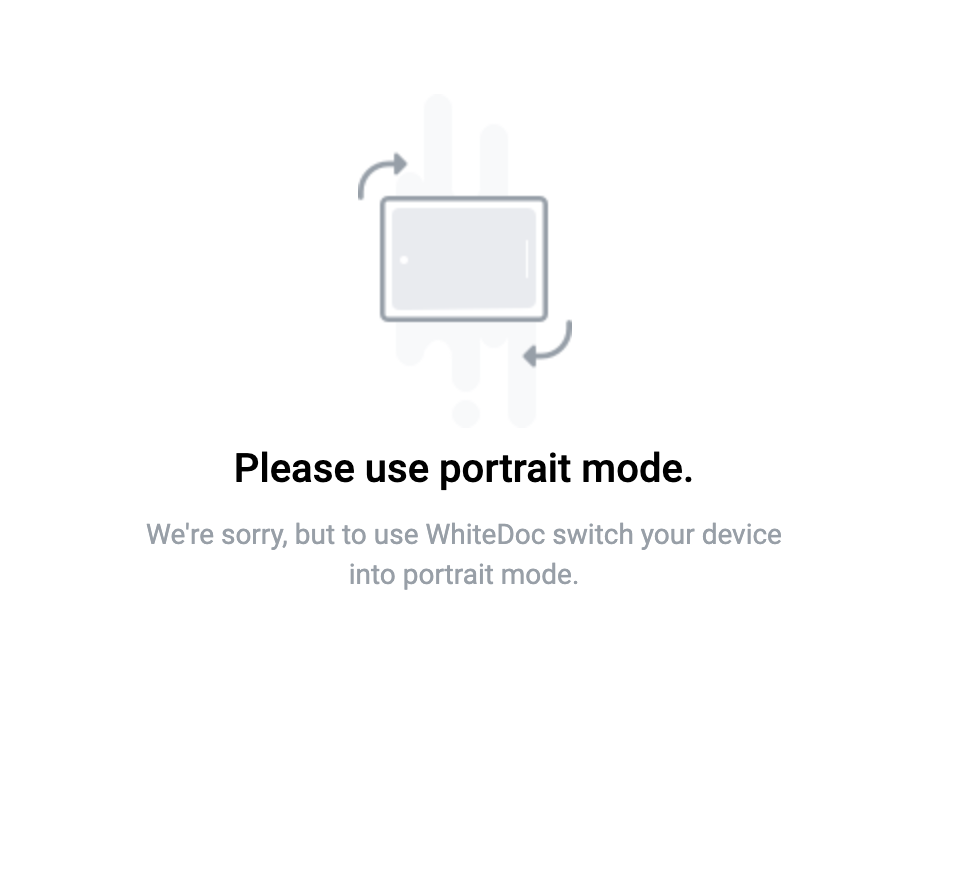
..note:: A notification screen with instructions is presented on unsupported screen resolutions.
Supported OS and browser versions
We cannot specify a particular version, but we will consistently support the latest versions of operating systems and browsers as per the list below
latest 2 Chrome major version
latest 1 Firefox major version
latest 2 Edge major versions
latest 2 Safari major versions
latest 2 iOS major versions
latest 2 Opera major versions
latest 2 OperaMini major versions
Firefox ESR
Note
we’re not supporting IE 11 (Internet Explorer)
User messages
If the user is using a desktop computer, they will be prompted to:
“Oops… Screen resolution you use is too small to work comfortable. Please, expand your browser window on full screen and decrease page scale: on Windows and Linux - press on Ctrl + Minus (-) on macOS - press on command button on keyboard + Minus (-) Thank you! We are working to solve this.”

If the user is using a mobile or tablet device, they will be prompted to change it orientation to album or portrait:

